— Wombat —
the blockchain in your hands
How we made the technology more common and approachable for more than 2.5 million users

The general vision for Wombat was to make blockchain technology more common and approachable for end users. After several years of blockchain consulting it was the first very own product of Spielworks GmbH. Wombat started as a mobile EOS wallet with a focus on usability for easy management of holdings and access to decentralised Apps (dApps). Over time we added support for further blockchains and a browser extension. At some point we also had a redesign to focus more on gaming.
Scope and constraints
The project started in May 2019 as an ongoing project with no specific timeline or fix deadlines.
Platforms
First we developed native mobile apps for Android and iOS followed by a browser extension for desktop use.
Tools
Sketch
Zeplin
Affinity Designer
InVision Studio
Notion
Jira
Slack
The team
The team changed overtime and included up to 11 people:
Project Manager
Marketing & Support
Several Developers for Backend, Android, iOS, extension
Designer
My role
As the only designer in the team I covered several aspects:
UX and UI design for the whole product on all platforms
Styleguide
Component Library
Redesign in dark UI with gaming focus
Enhancement with new features
Handover to the development
The user
When we started to build Wombat we had different target groups in mind.
We wanted to address people who are familiar or at least interested in blockchain technology and give them better usability for their needs.
But we were also designing and developing for people with no idea of blockchain or even with no technical background at all.
Casual gamers were always in our mind and later on we shifted our whole strategy towards gaming.
How can we make blockchain technology broadly accessible?
Building a low entry EOS wallet with easy access to assets and dApps.
Especially for people with no tech background it is difficult to access the blockchain market. Most crypto wallets are very complicated to use and a technical terminology is often very daunting. The mission for Wombat was to build a product for easy access to blockchain technology to gain and manage assets and to use dApps and games. The main questions we asked ourselves:
How do we attract users and what can we promise?
While most crypto wallets on the market are very technical and complicated to use we wanted to create a very smooth user experience. All technical aspects should be hidden as much as possible without compromising for transparency or functionality. Another feature to distinguish from most competitors would be the integrated experience with dApps.
How do we keep users engaged to increase the retention rate?
In order to grow our active user base we integrated a referral program and had a redesign later on to focus more on gaming and attract a bigger target audience.
How do we minimize the drop-off rate during onboarding?
When we started growing our user number we saw a huge potential in improving the onboarding to minimize the drop-off rate.
Clean and tidy UI with straight forward UX
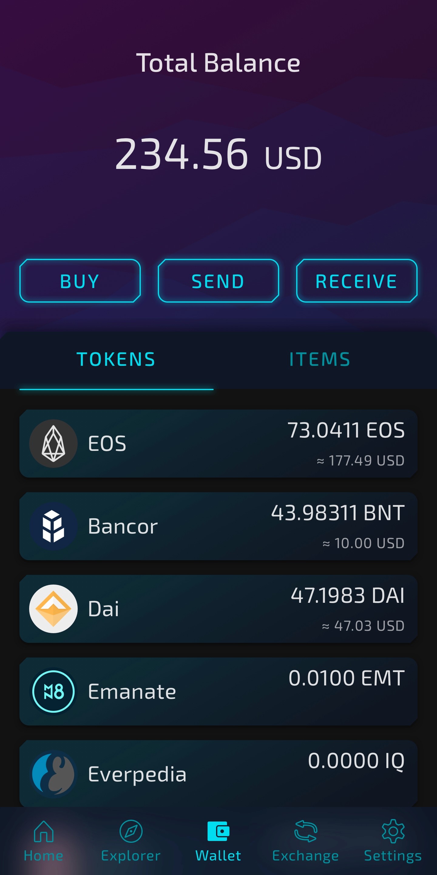
Since crypto currency and blockchain technology is pretty abstract for most people I wanted to build a logical information architecture for our app with profound mental models for any aspect throughout the experience.
We always aimed for common language and strong metaphors for abstract elements. The section for holdings for example we called “Wallet” and not something like “Account”.
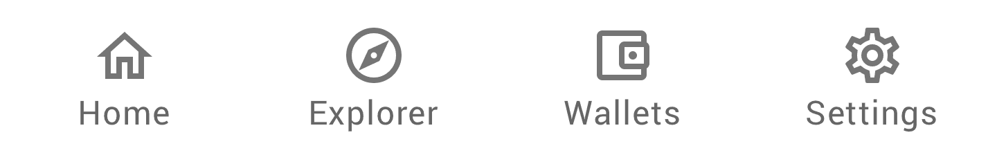

We went with a simple menu structure with distinct sections and I designed the menu with accessibility in mind with outlined grey icons for the inactive state
in contrast to filled icons in primary colour for active menu states which is not just helpful for people with colour vision deficiency.
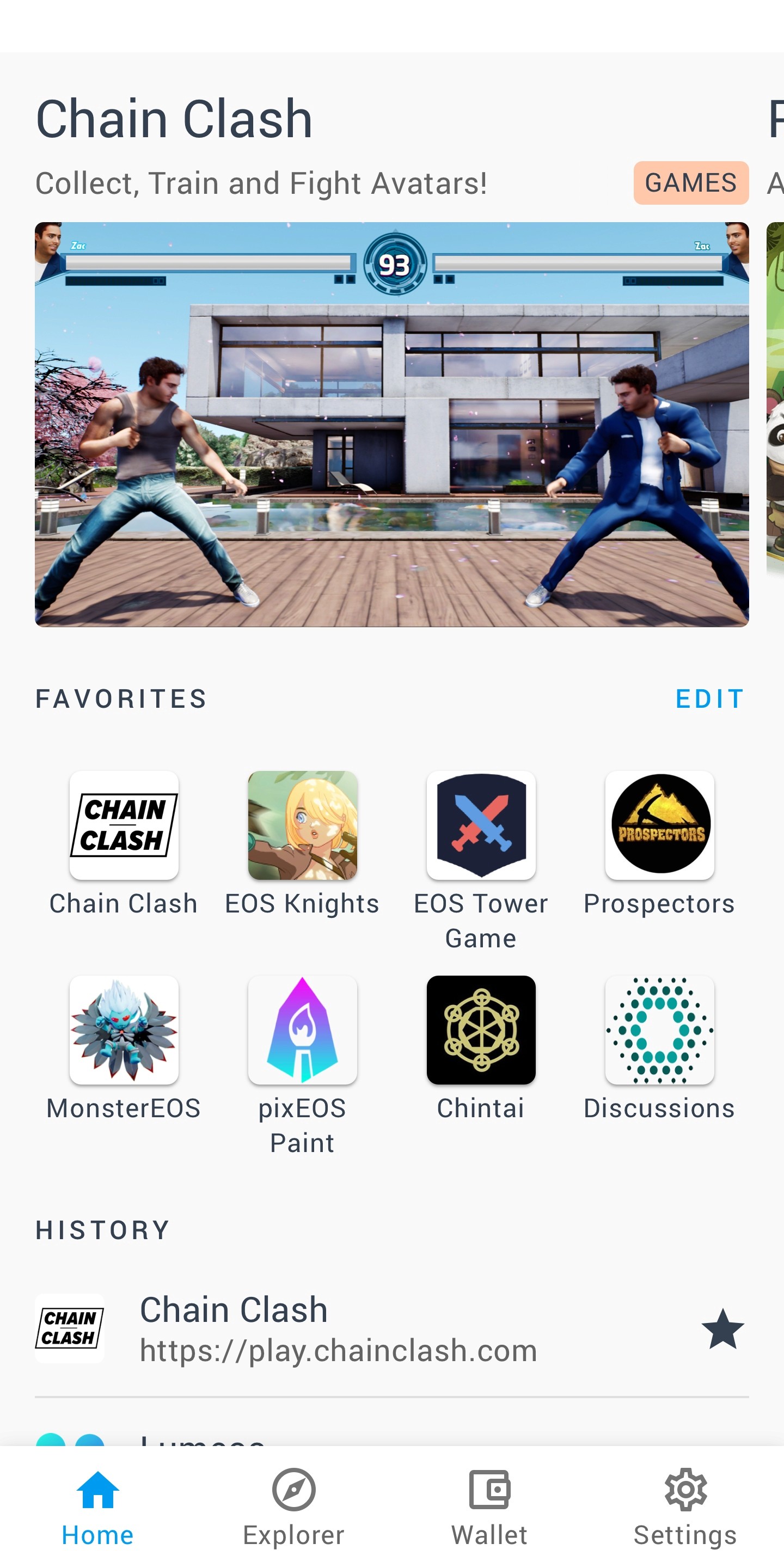
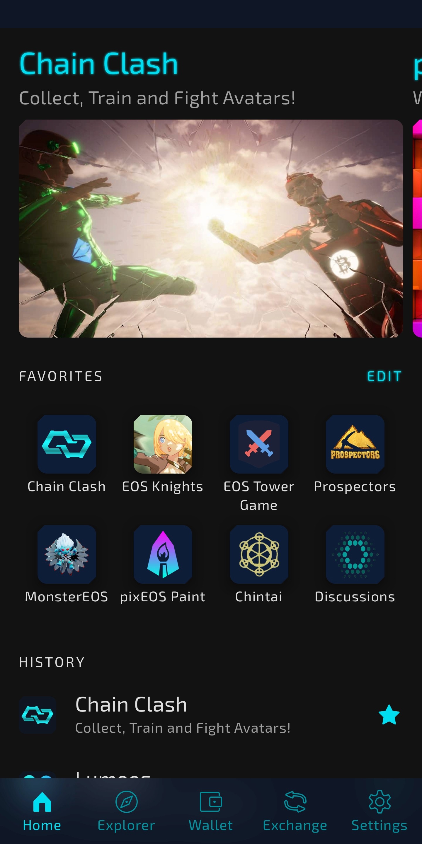
Home for favorite dApps and recommendations
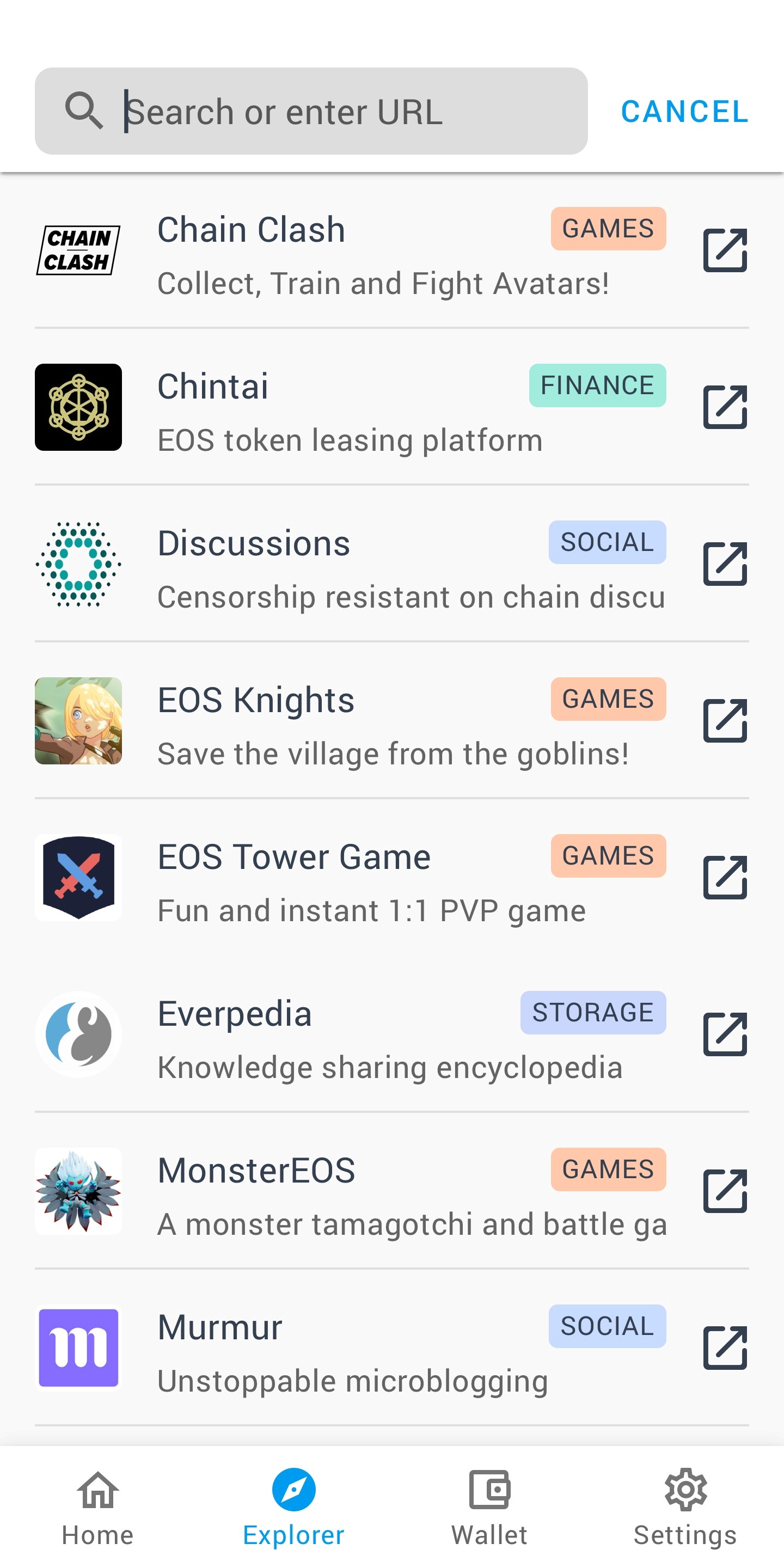
Explorer to find new dApps
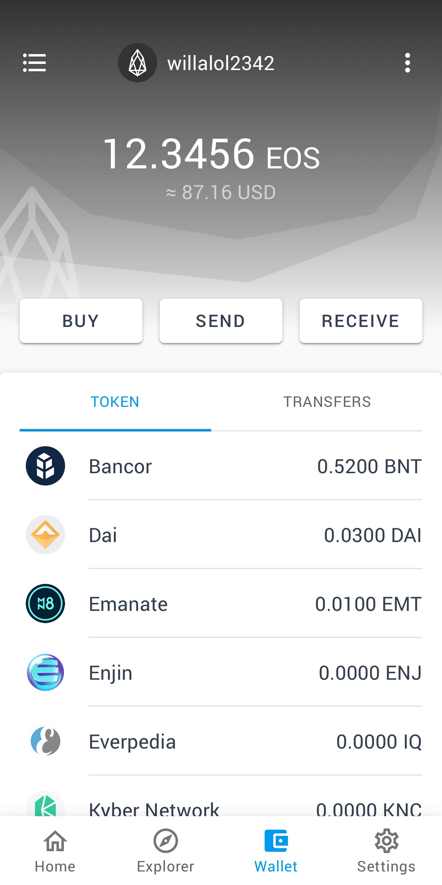
Wallet for all the holdings and transactions
Settings for Account and App preferences
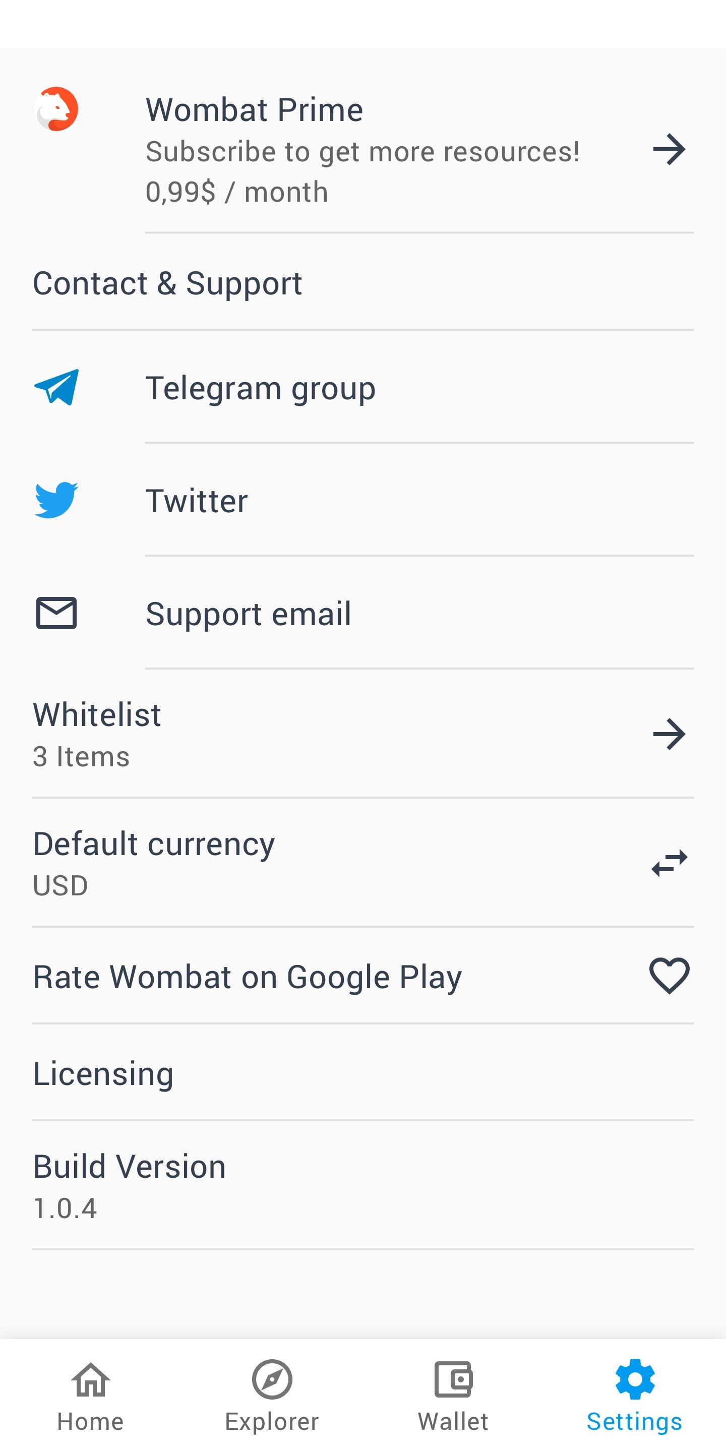
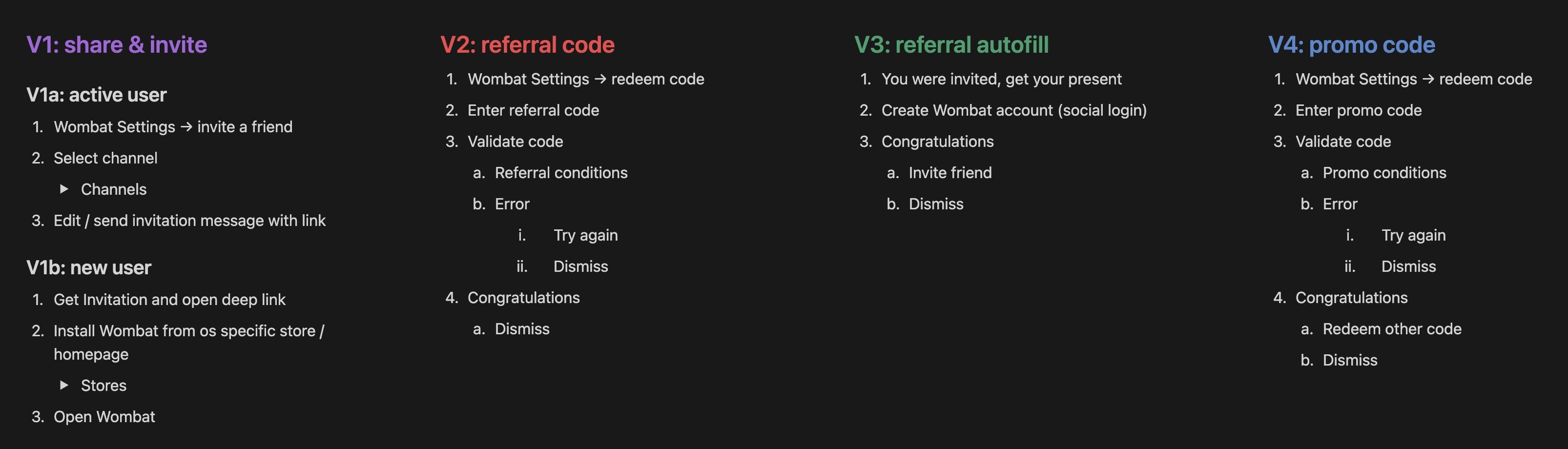
Referral program
In order to increase user satisfaction and to win new customers we integrated a referral program. That way existing users have an incentive to share the app with their friends and to build up trust and customer loyalty.
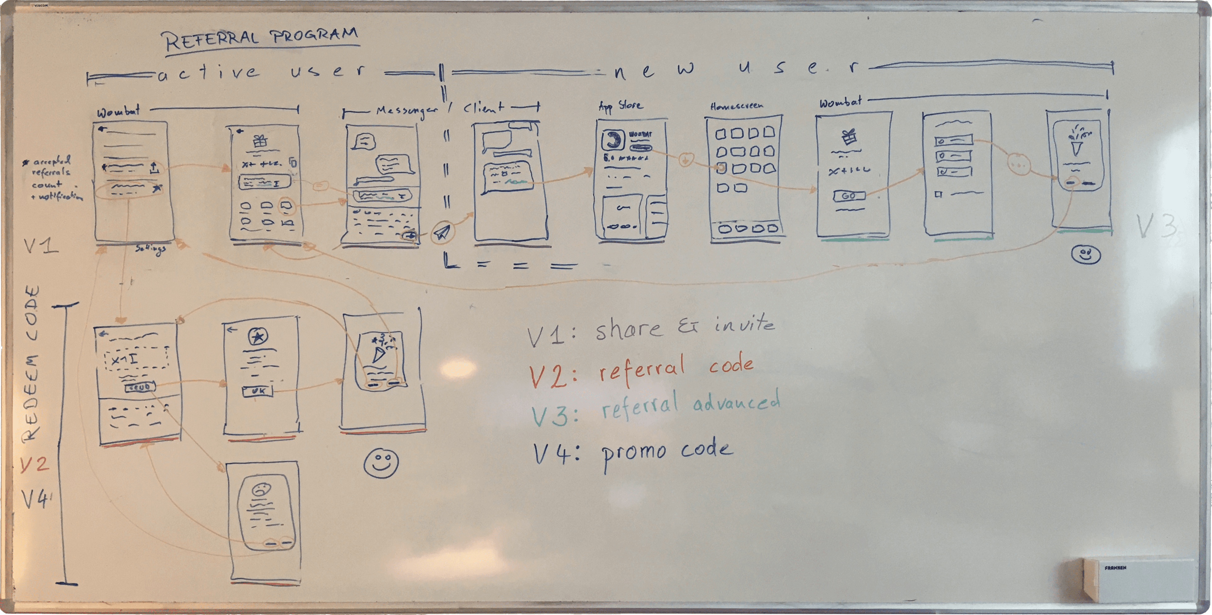
We split the design and development into four sequential segments where V1 and V2 represent the MVP and V3 and V4 are additional features we wanted to build on top.
Redesign for gamers as target group
With our redesign we wanted to focus on gamers as our new target group. First of all the gaming market is very big and still growing. Also gamers are rather playful and open to new technologies. Therefor it made a lot of sense to redesign Wombat with gaming in mind. Most of the redesign effected the style of the interface when it comes to colours, typeface and shapes.


The Moodboard was helpful to collect visual inspiration for the redesign. We went with a dark theme with neon colours and glow effect influenced by cypherpunk not just to reflect a futuristic style but also to incorporate the technological aspects of a crypto wallet.
In the course of the redesign I created individual icons to match the style and to create strong visual metaphors.
The main shape for the new UI elements is something I am pretty proud of. It supports a unique experience of the interface but is also subtle enough not to distract. Using rounded corners is very common because they help to process visual information better. With the technical aspect of blockchain in mind I wanted to give our UI elements a bit of an edged appearance without loosing the smoothness of rounded corners entirely. That’s why I came up with the simple but effective idea just to cut diagonal corners in the upper left and the lower right and to round lower left and upper right corners respectively.
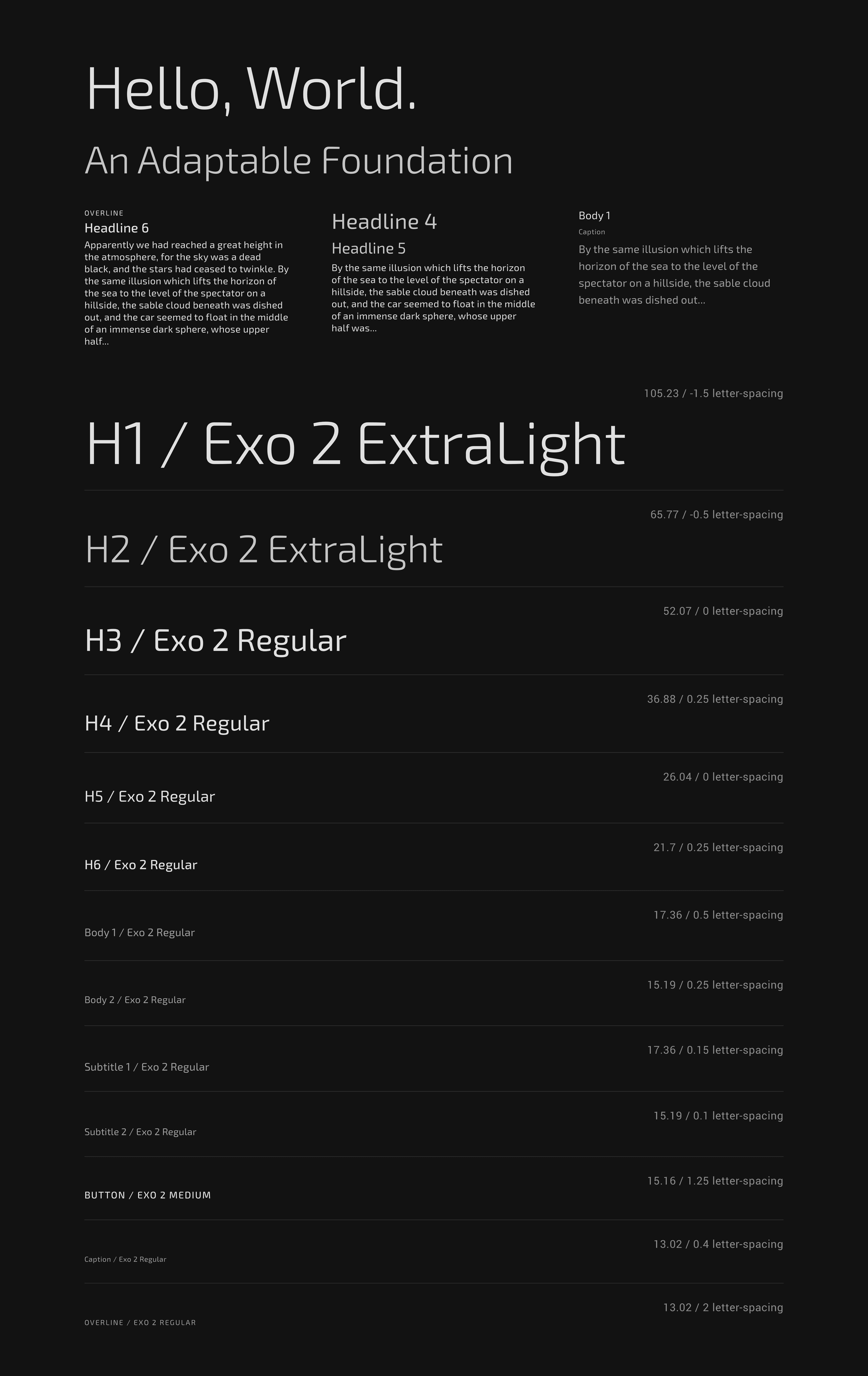
For our main typeface I was looking for something unique on one hand but also not too special in order to be accessible on screens even in small fonts and different languages. After testing and comparing several typefaces we were very happy with Exo 2 because it absolutely served our needs and suited our language of form with small curves tight arches and straight lines.
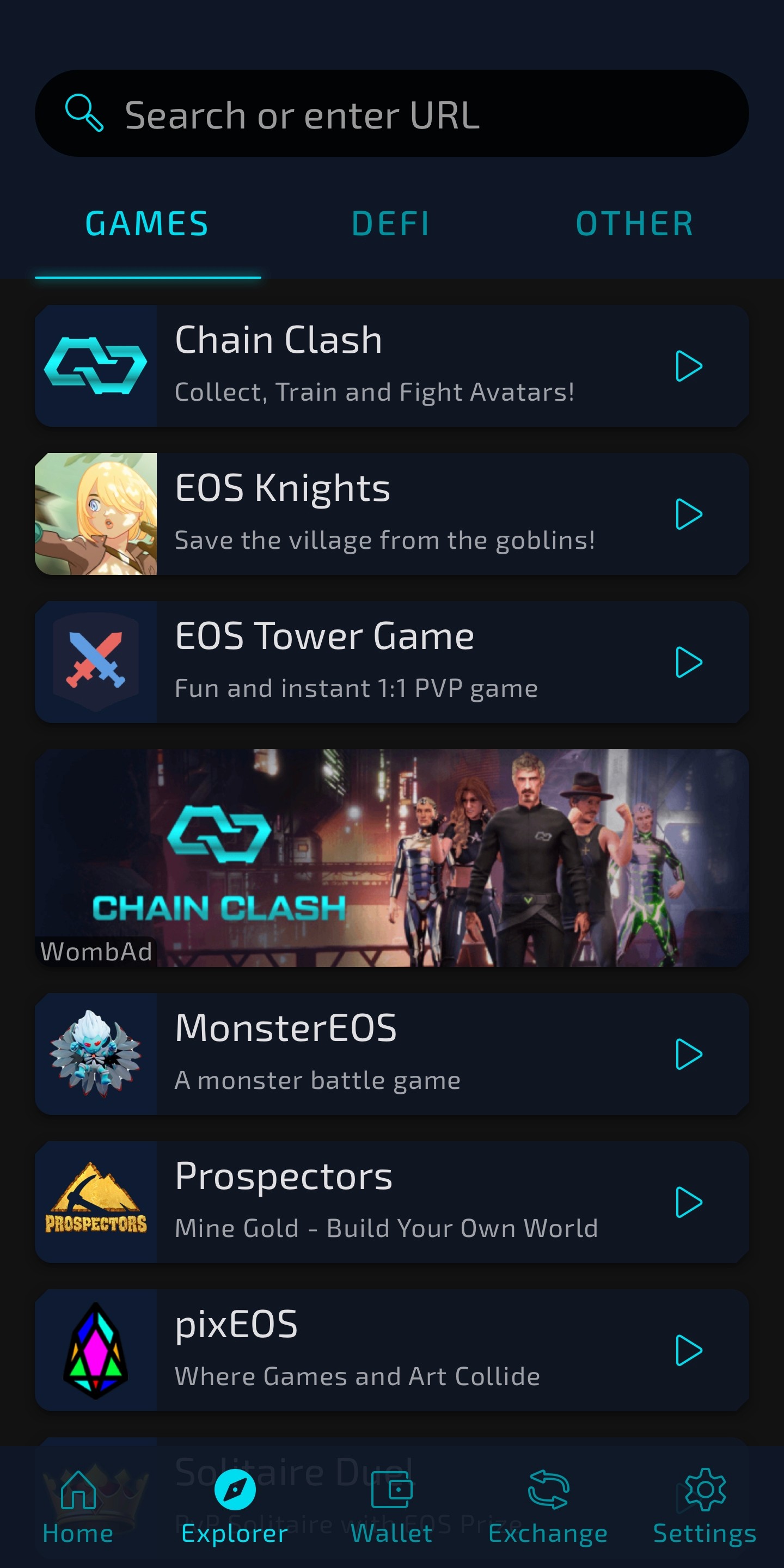
We also adapted some interface elements to suit the new focus. One major change in that direction was to split the listed dApps into “Games”, “DeFi” and “Other”.
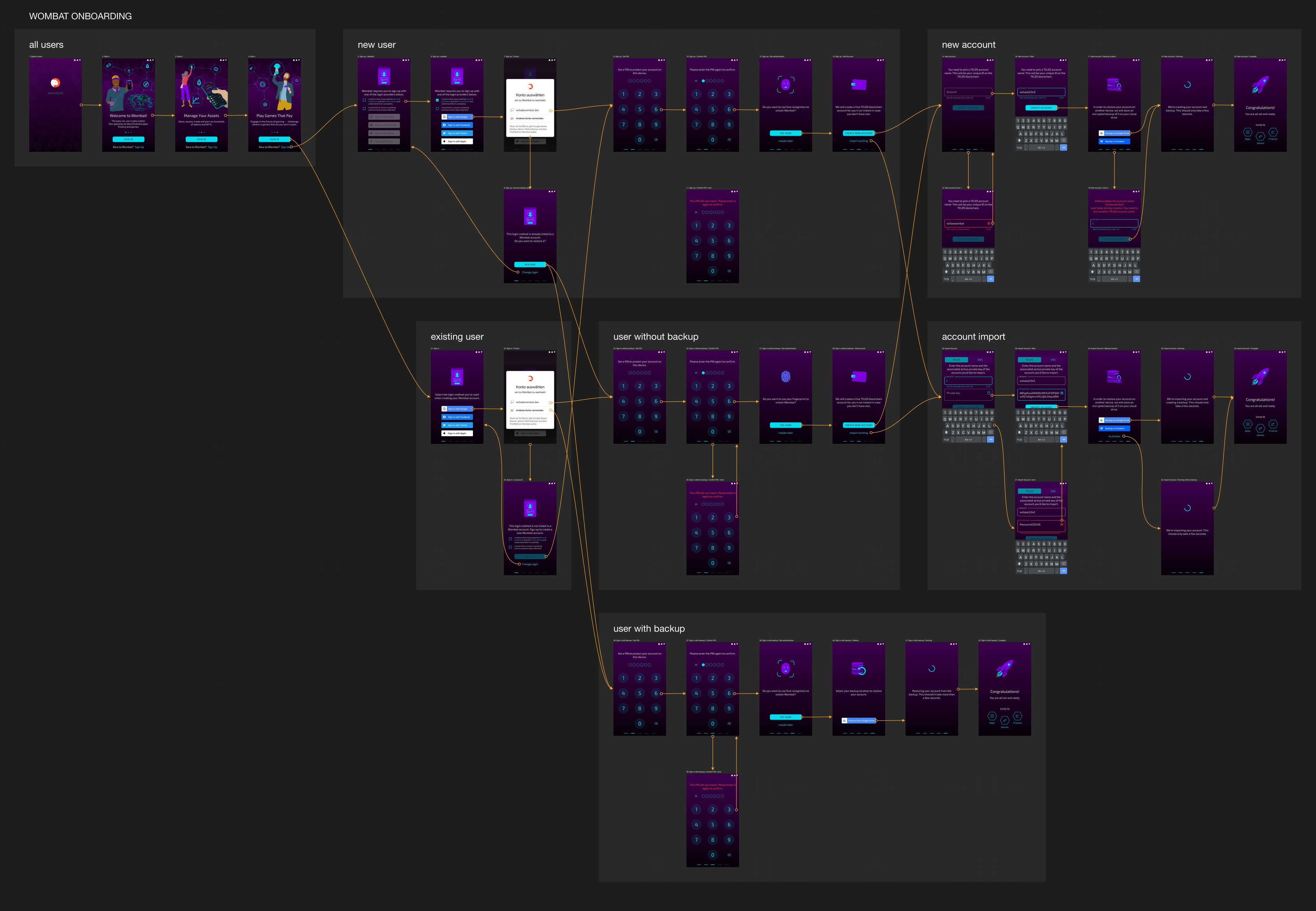
Improved Onboarding to lower the drop-off rate
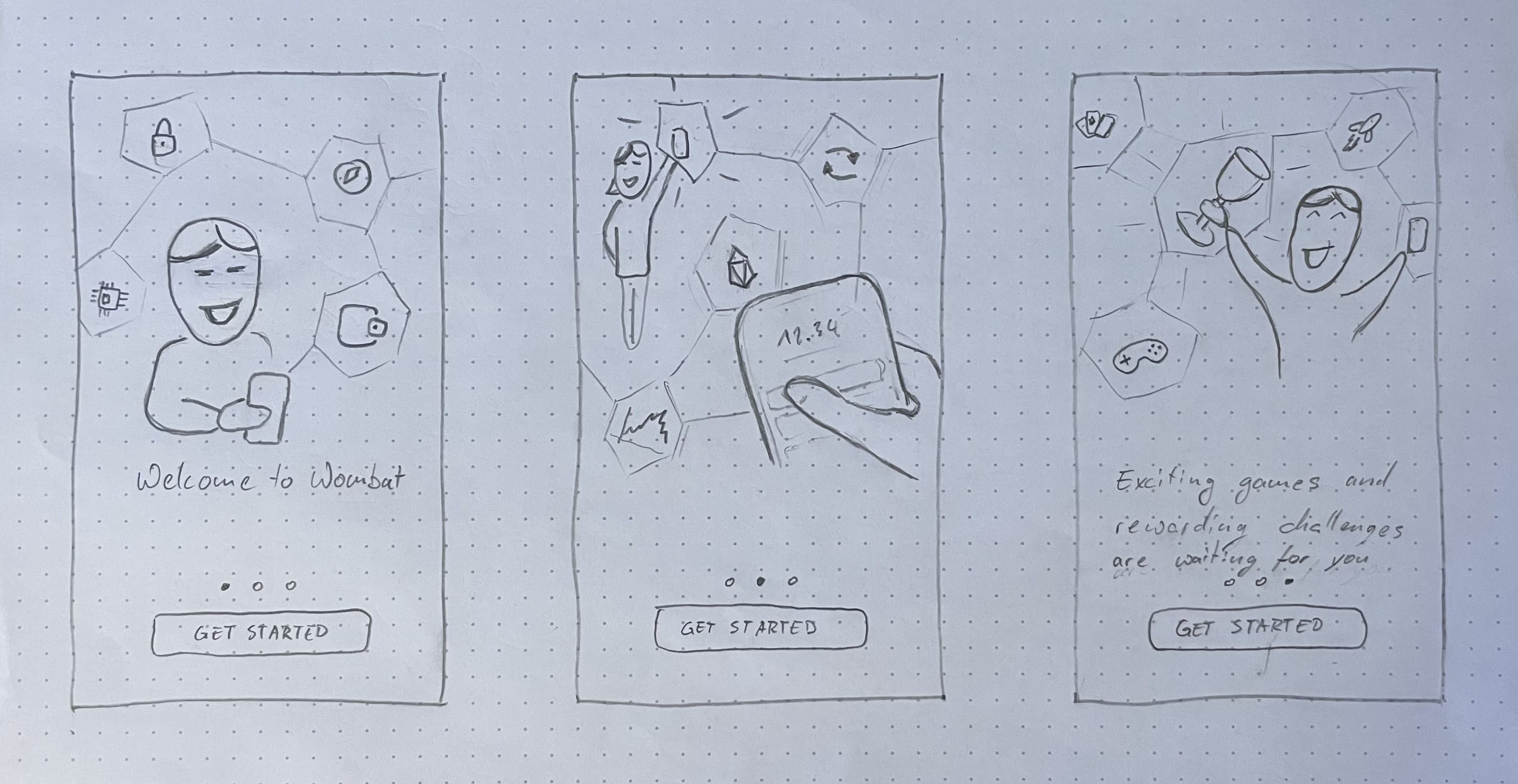
With increasing download numbers we wanted to improve our onboarding experience to lower the drop-off rate significantly. While our onboarding includes some very technical aspects I had to figure out how to streamline the user flow.

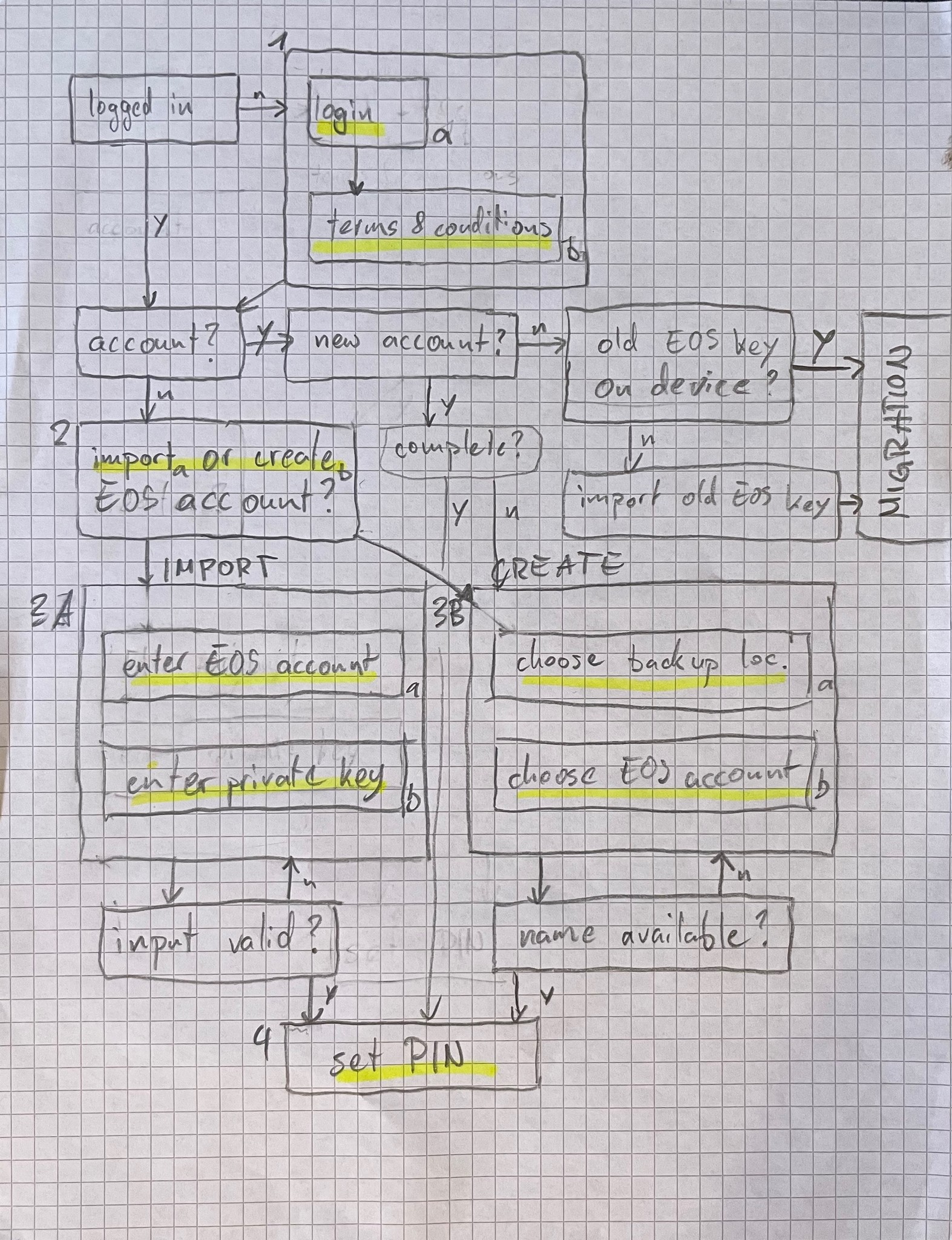
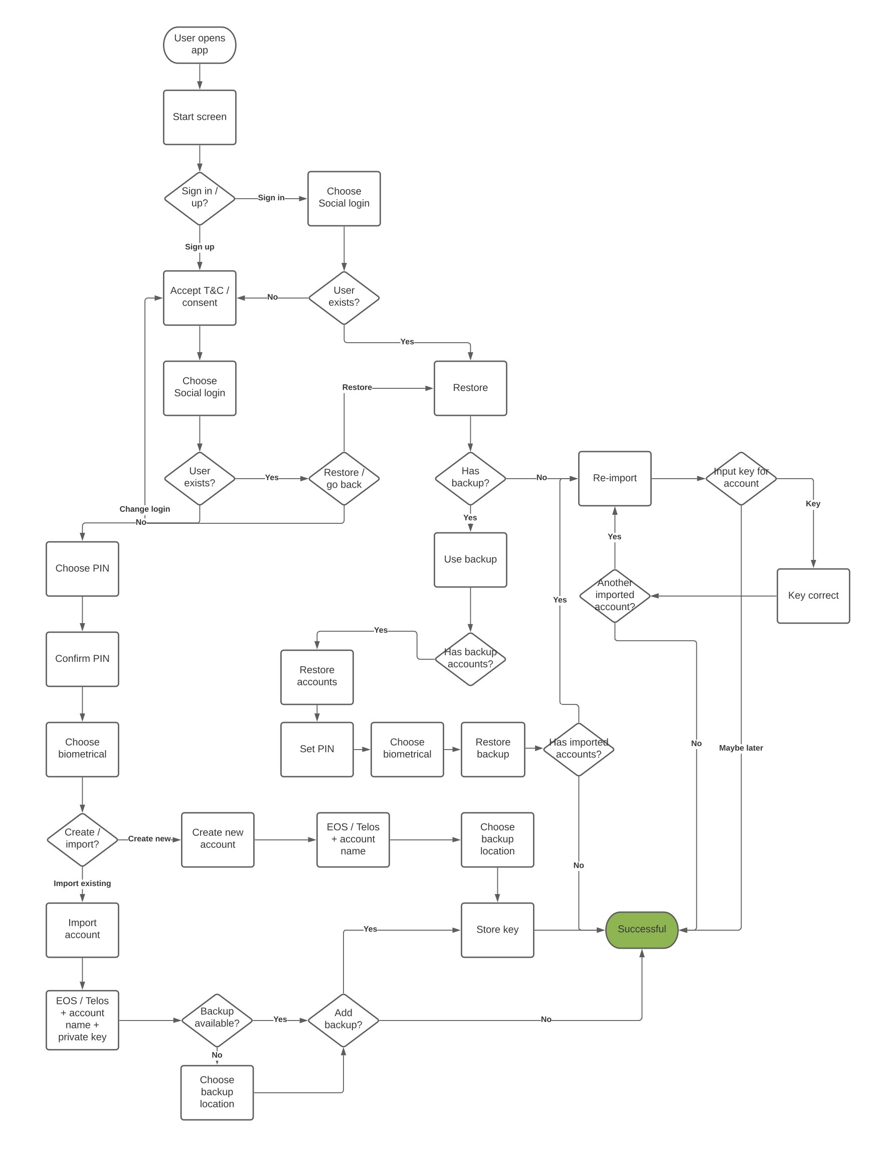
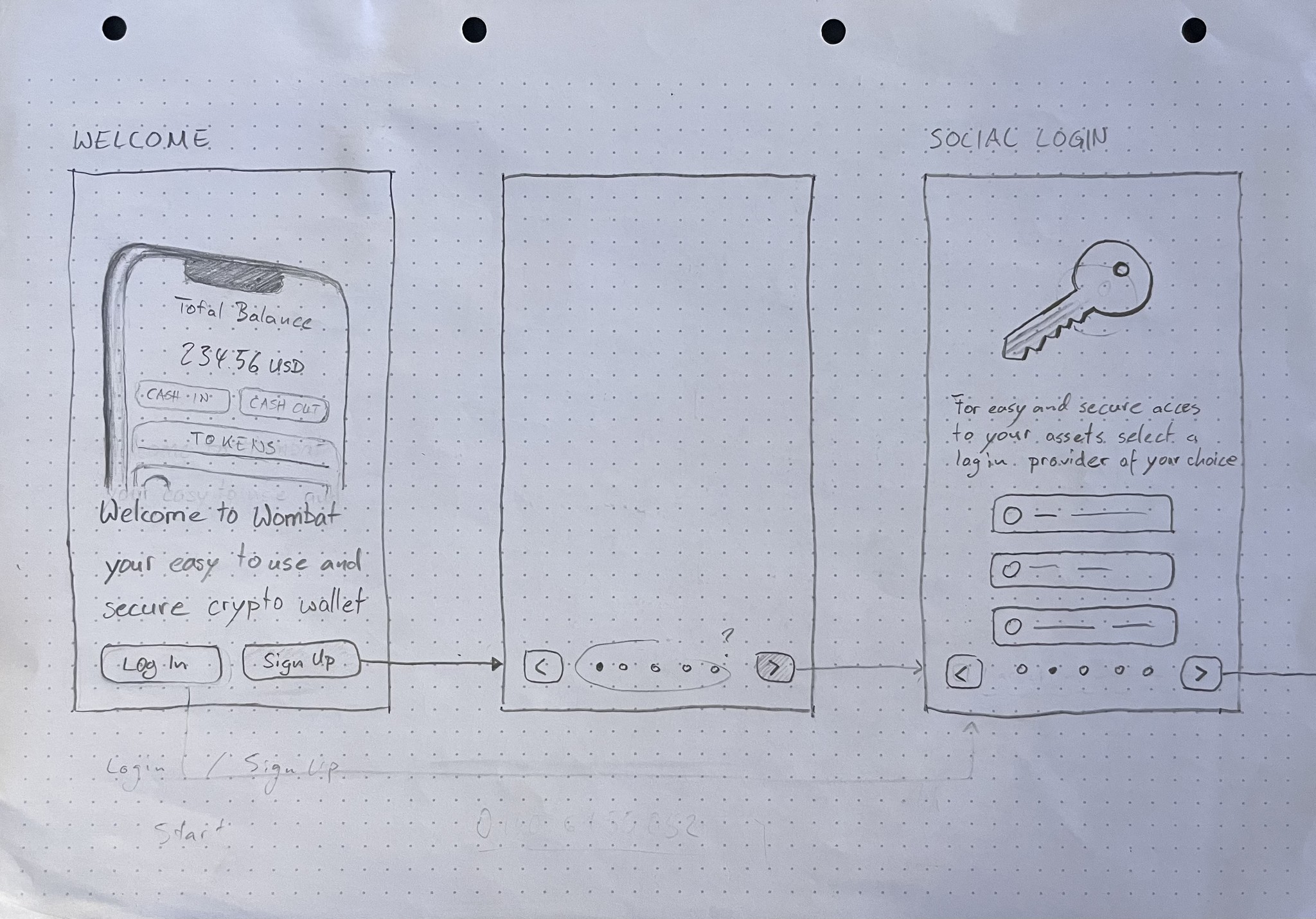

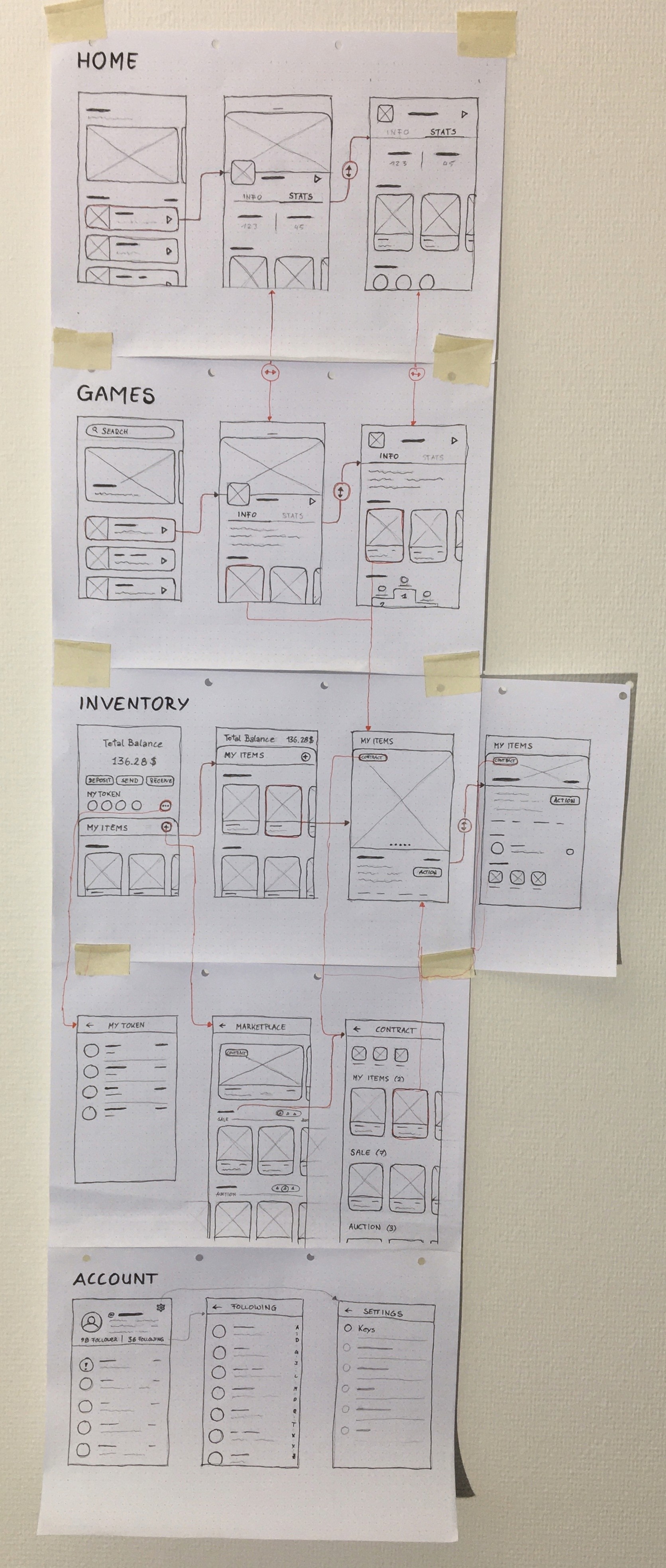
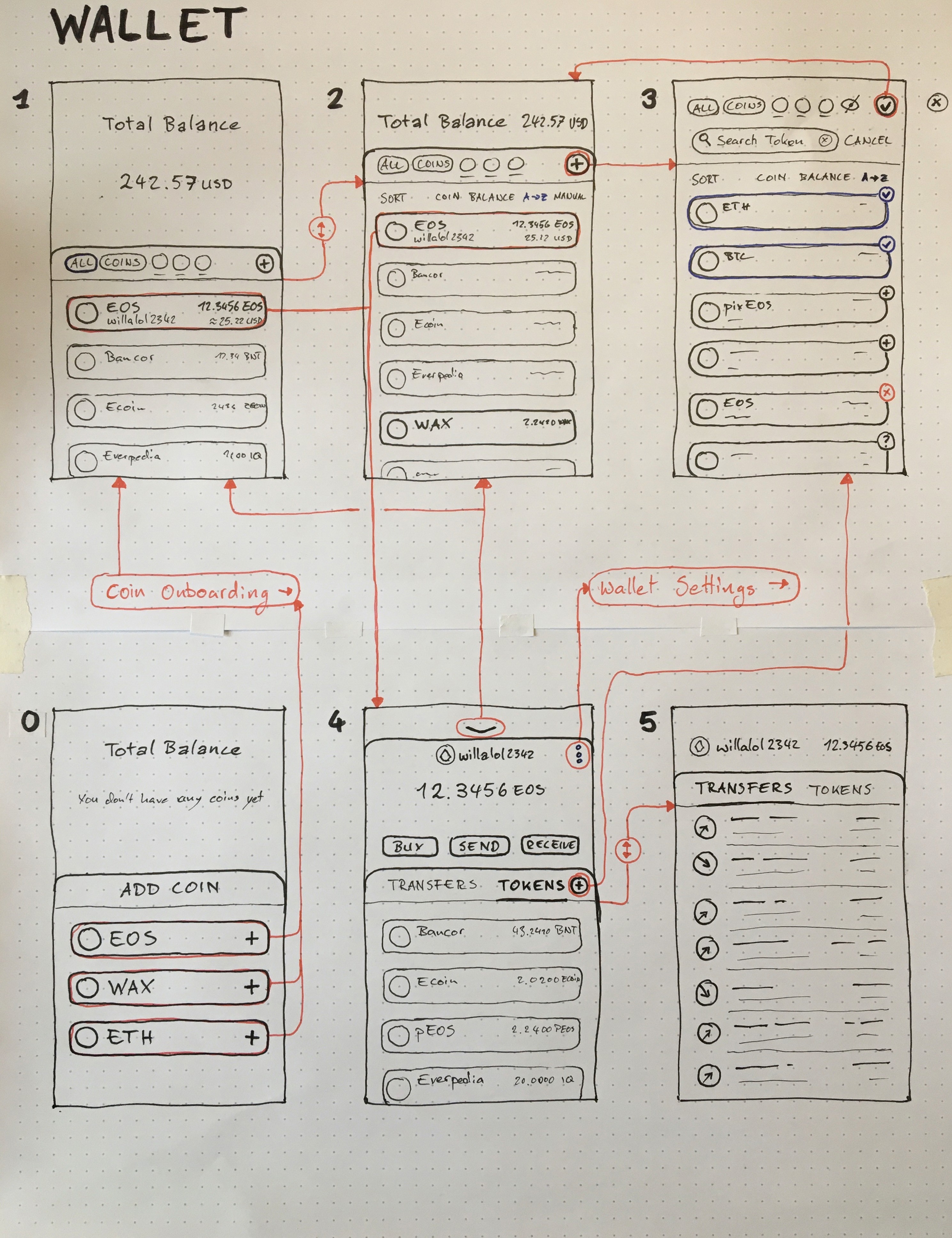
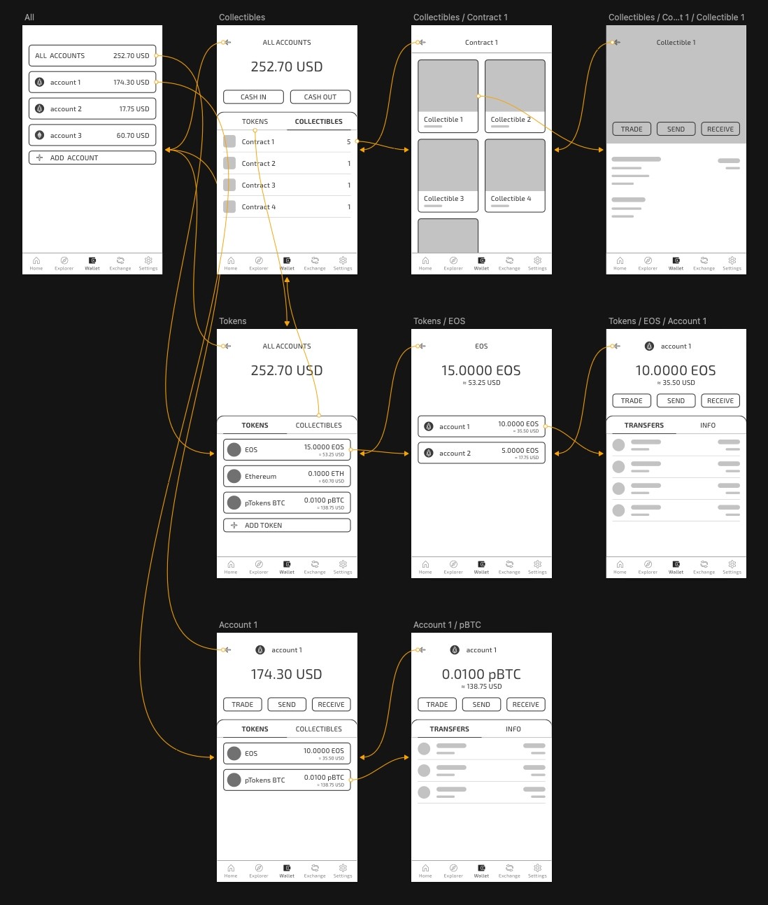
Once the general architecture was clear and settled with the backend developers I was able to translate that structure to a first draft of wireframes.
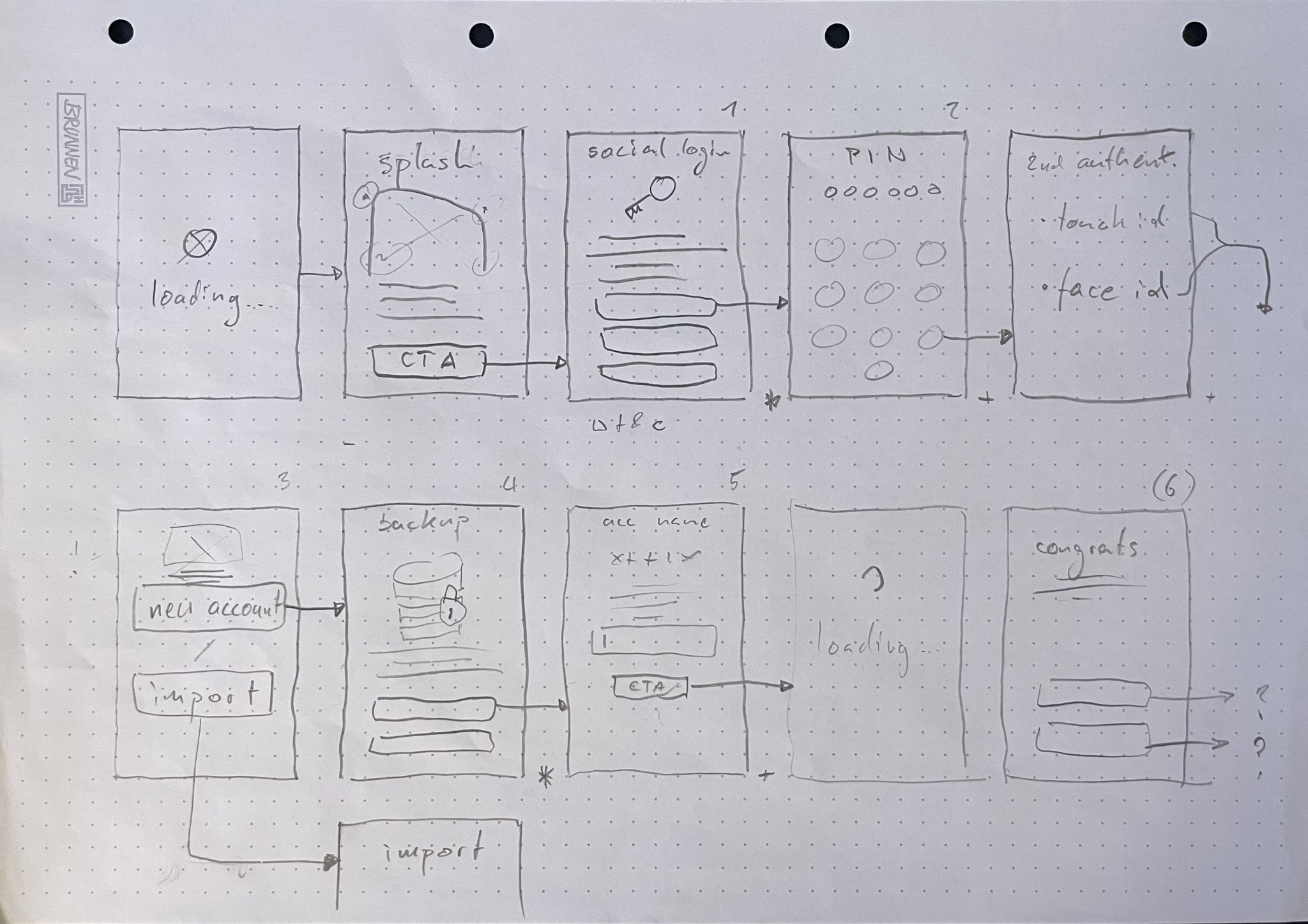
We decided to use illustrations and start the onboarding with a strong visual introduction…

… not just to retain the users attention but also to give an overview of what to expect from the app.
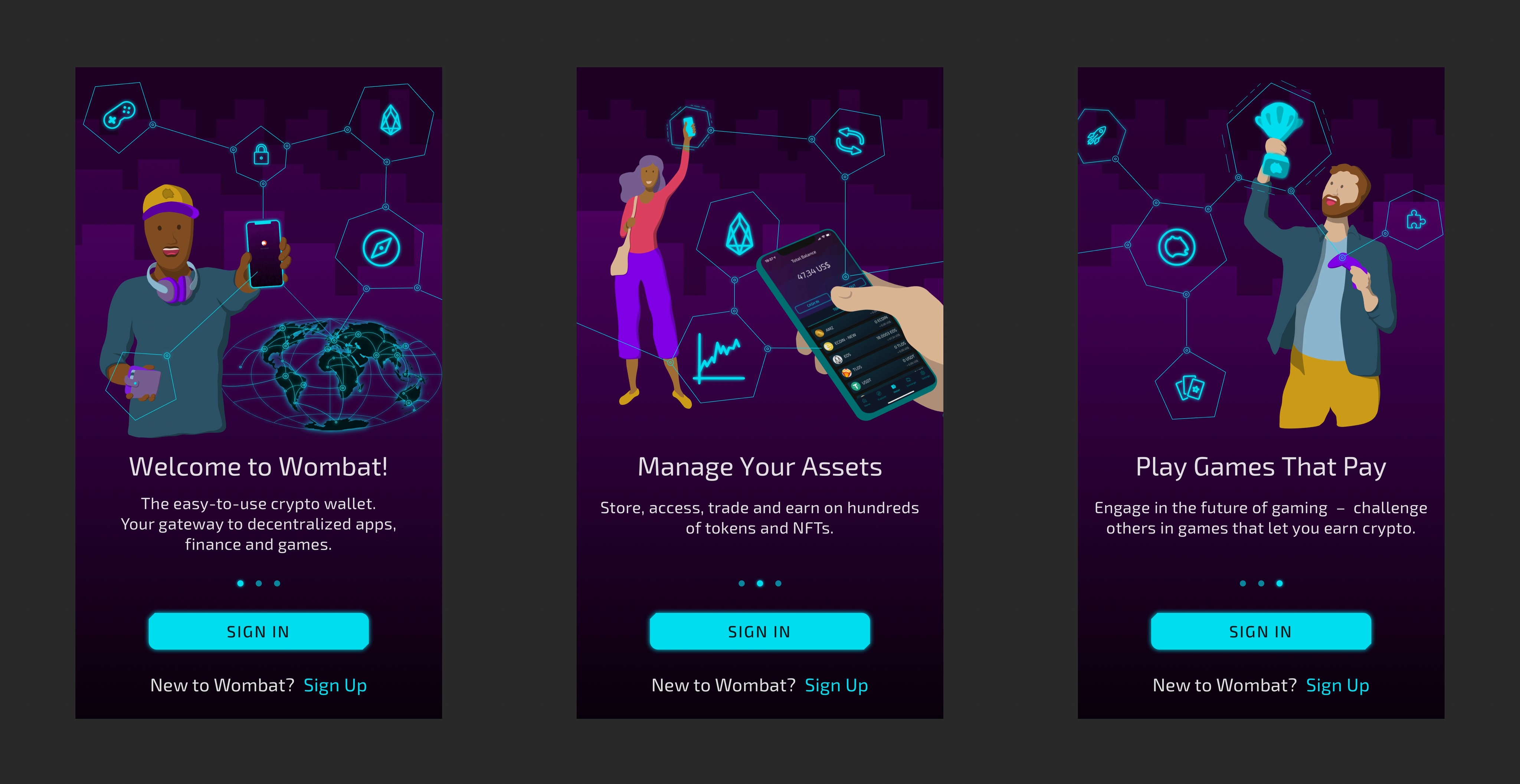


During the introduction slides users are always able to sign up or sign in. In order to comply with our security standards the flow requires the setup of a PIN-verification and the option to use a biometric authentication method instead.